Sunny Isles Beach Rebranding
I was fortunate enough to come into my position at Sunny Isles Beach at the beginning of their rebranding journey. It was quite an uphill battle, but with the full support and creative forces of both the in-house team and the team over at Jacober the branding was finally able to set sail.
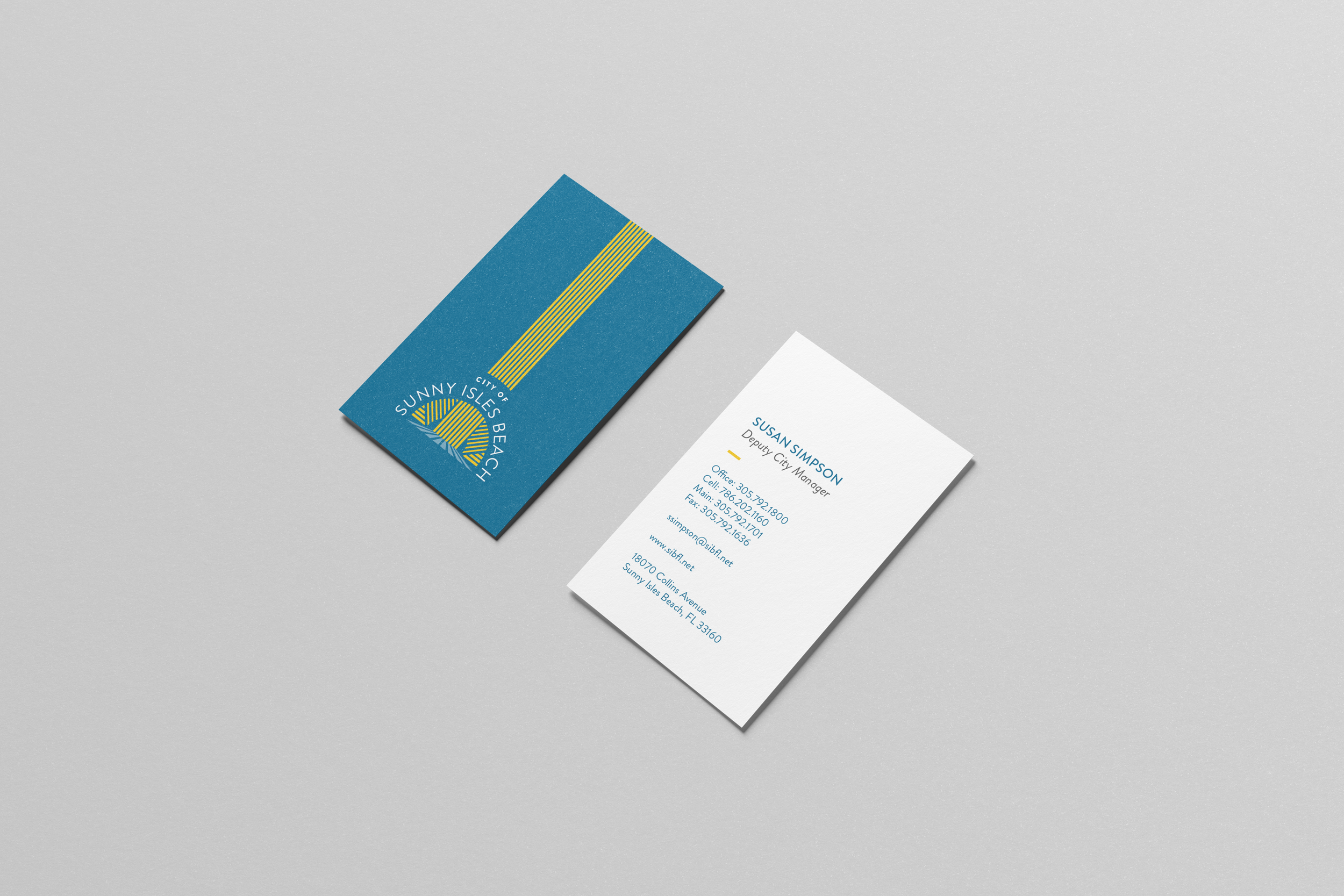
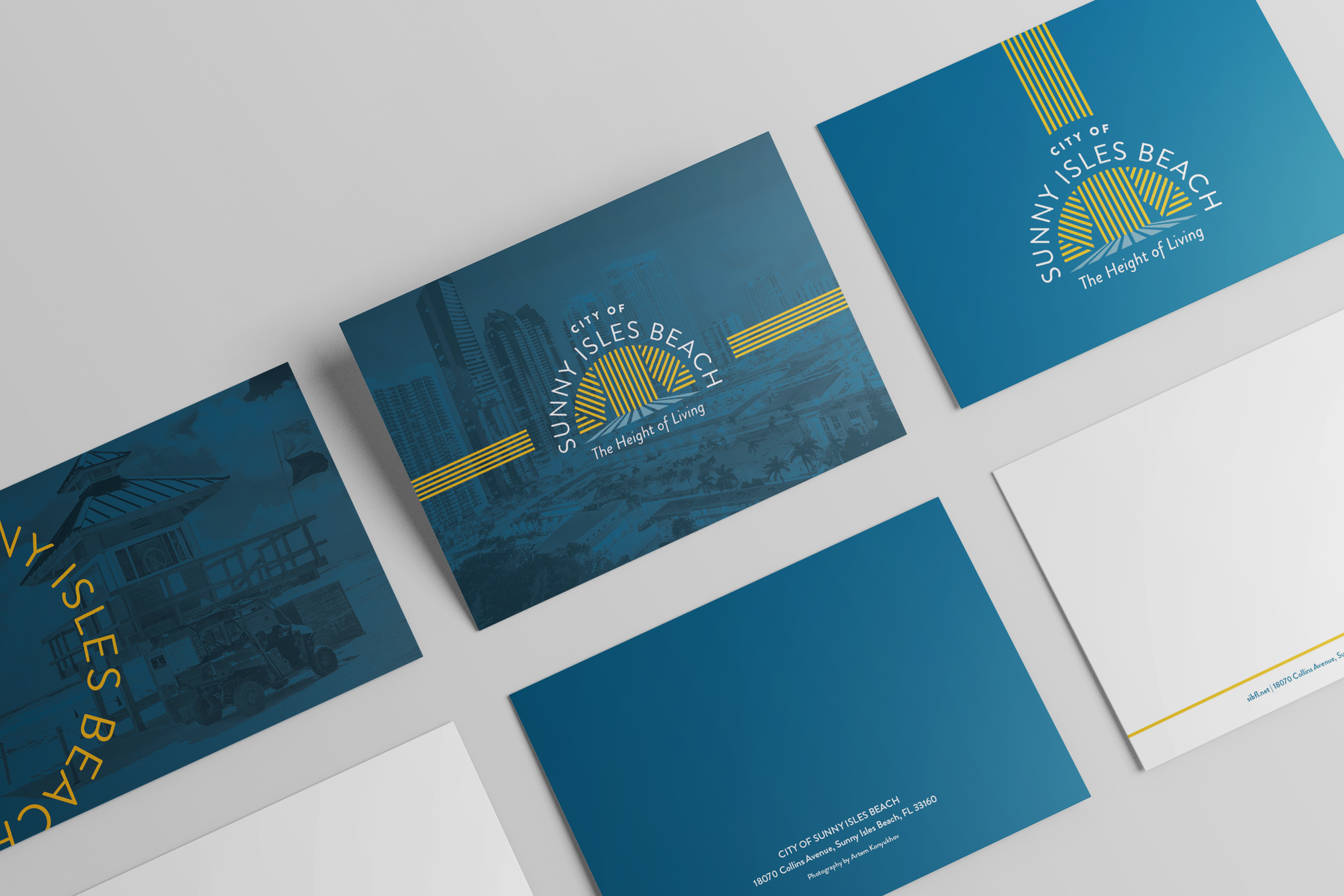
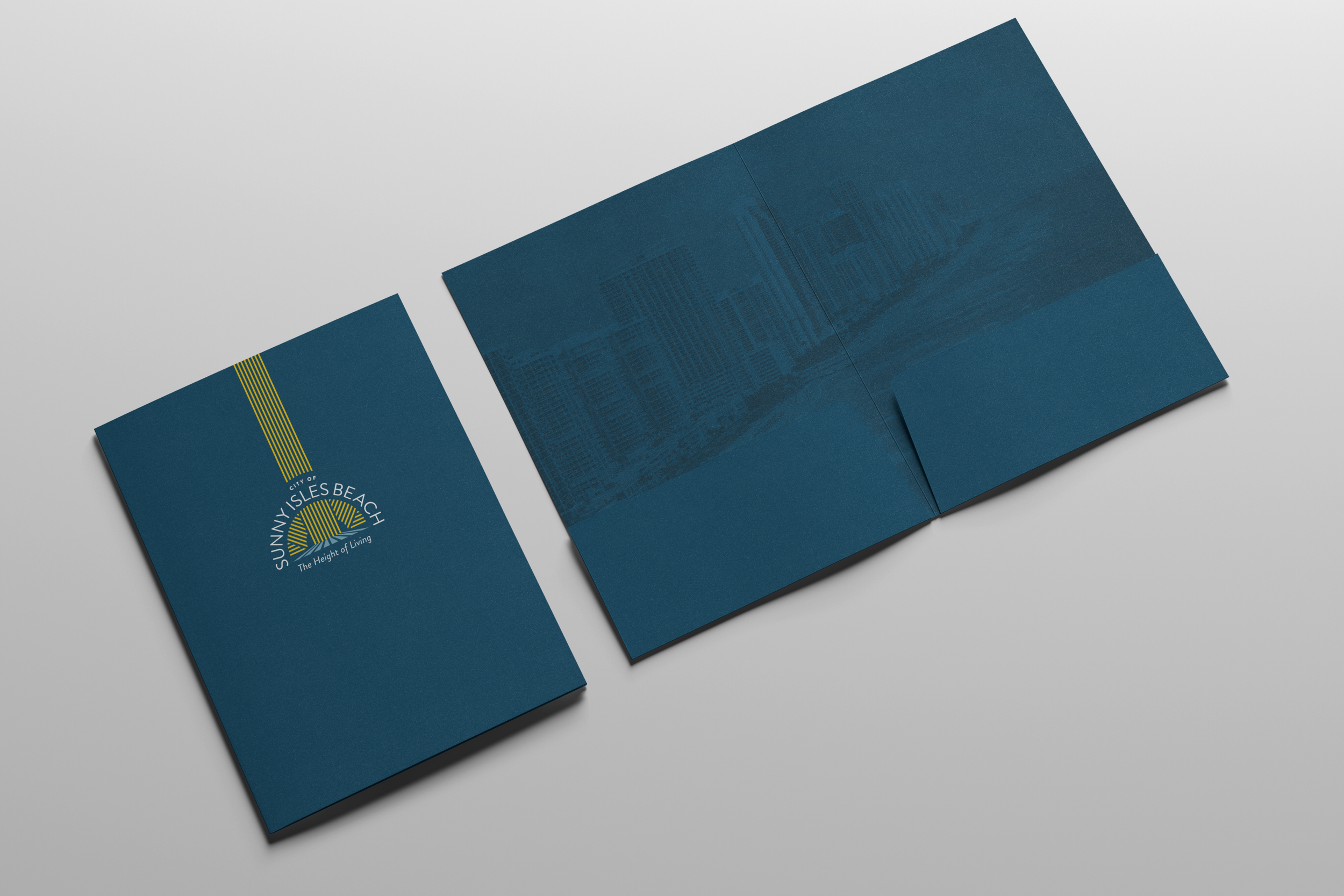
It took a lot of collaboration on choosing the right design. We wanted it soft, yet strong. Authoritative, but inviting. Something that was iconic for the City, so after months of deliberation a skyline hidden amongst a rising sun was the champion.
The team struggled with the initially proposed color palette. It felt like both City officials and Jacober went through endless swatches, but after some serious Accessibility trial and error, we all settled on the options below. For the City, Accessibility was a huge player in the rebrand so it was taken into mind every step of the way.
I am so proud to have helped and help to develop this brand; refreshing sub-brands, pushing the limits of the brand standards we jointly set in place and updating and creating a unified look across the entire city in every capacity.


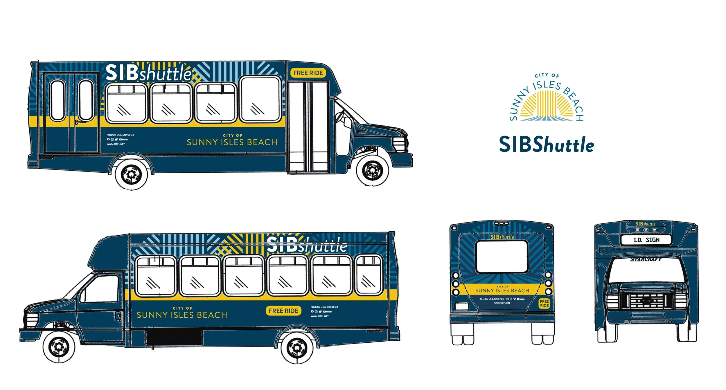
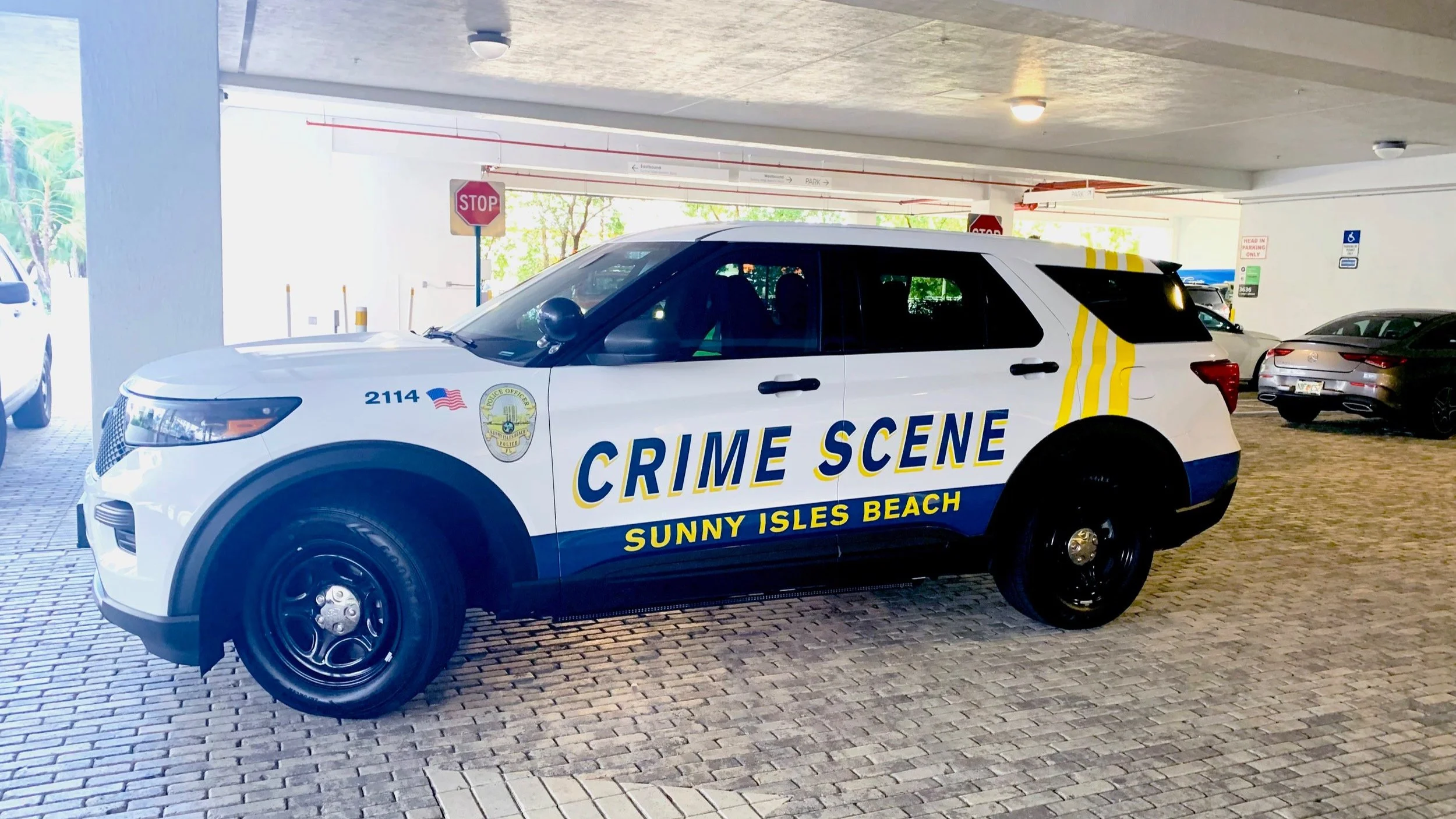
Sunny Isles beach police vehicle refresh


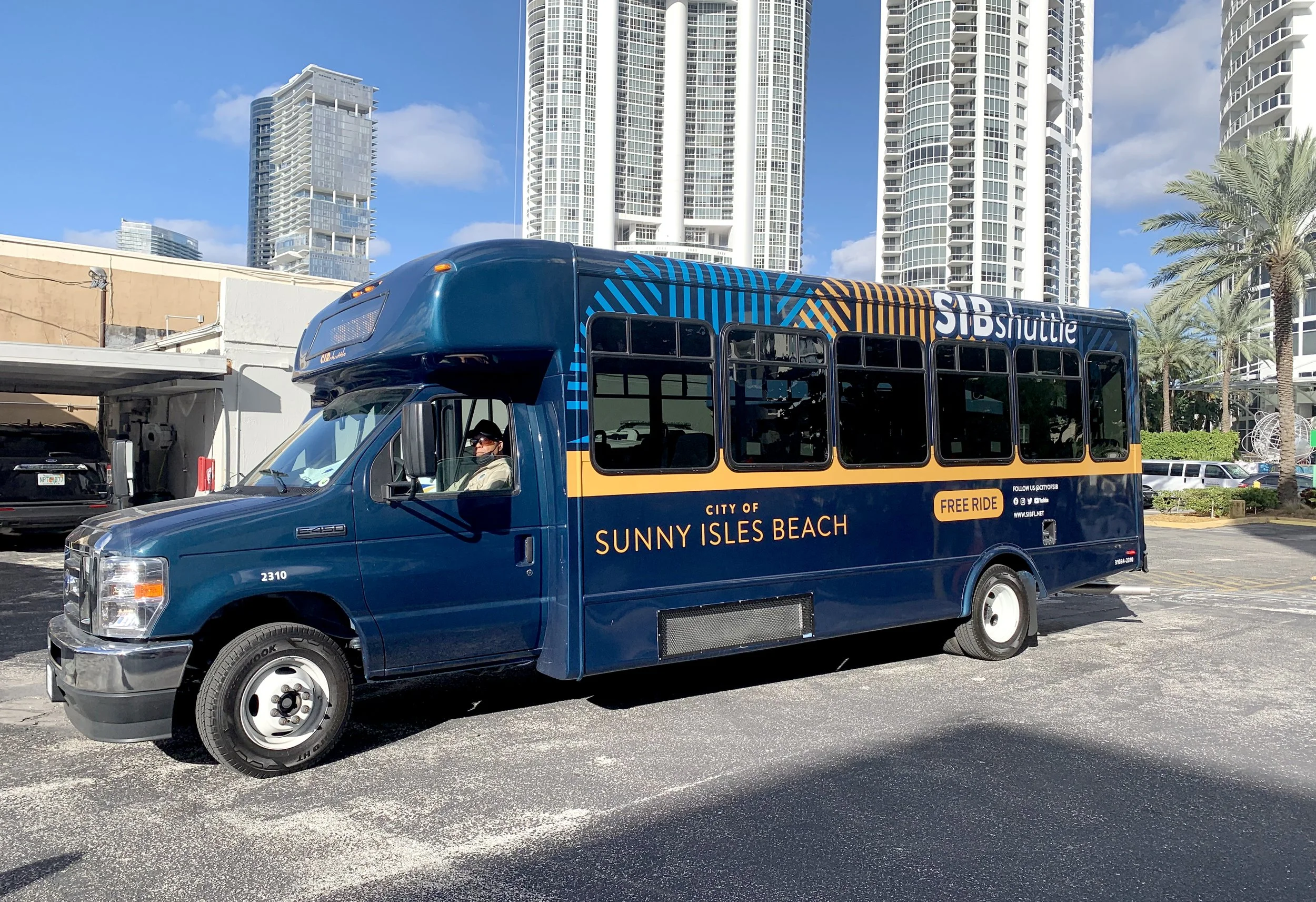
ADDITIONAL City VEHICLE refresh